SwiftUI アクションシート actionSheet

ActionSheet

ActionSheetAlertによく似ていますが、複数ボタンが作れユーザーに処理を選んでもらう場合などに利用できます。

前回Alertについて書いていますので、興味がある人はそちらも御覧ください。

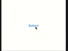
下のコードは、.actionSheet()使ったシンプルな例です。

import SwiftUI

struct MessageDlg: View {
    @State var bEnable: Bool = false
    var body: some View {
        Button("Button1", action: {
            self.bEnable = true
        } ).actionSheet(isPresented: self.$bEnable) { () -> ActionSheet in
            ActionSheet(title: Text("🌀 ゾルタスクゼイアン"))
        }
    }
}

コードを実行し、Button1を押すと下のようにActionSheetが表示されます。

SimpleなActionSheet
Simpleな ActionSheet

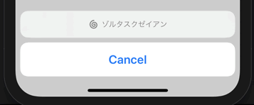
「🌀」はButtonイメージと同じで、文字色と同じベタ塗りになります。

ActionSheetにtitleとmessageを設定すると下のような表示もできます。

ActionSheet Message付き
message引数を追加

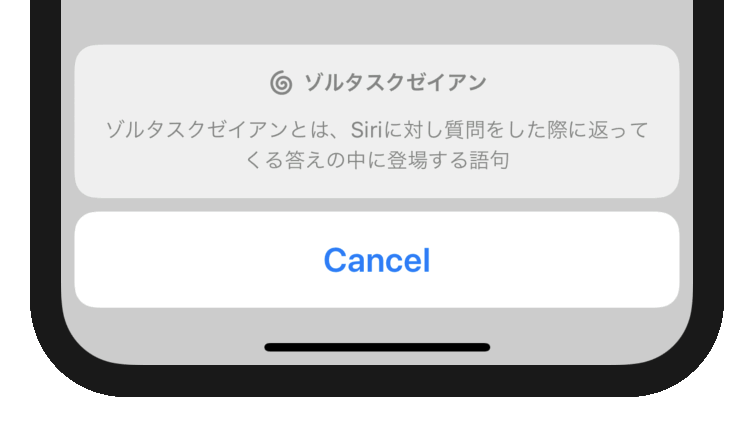
titleとmessageのみの場合、“Cancel”ボタンしかありません。それ以外のボタンも追加できます。

struct MessageDlg: View {
    @State var bEnable: Bool = false
    var body: some View {
        Button("Button1", action: {
            self.bEnable = true
        } ).actionSheet(isPresented: self.$bEnable) { () -> ActionSheet in
            ActionSheet(title: Text("🌀 ゾルタスクゼイアン"), message: Text("ゾルタスクゼイアンとは、Siriに対し質問をした際に返ってくる答えの中に登場する語句"), buttons: [
                .default(Text("Siriにきく")),
                .cancel(Text("怖いのでキャンセル"))])
        }
    }
}

ActionSheetのbuttonsに.default・.cancel・.destructiveが配列で設定できそれぞれにactionを追加できる。

.destructive()を使った場合文字に赤が設定される。

ActionSheet ボタン追加
ActionSheet ボタン追加

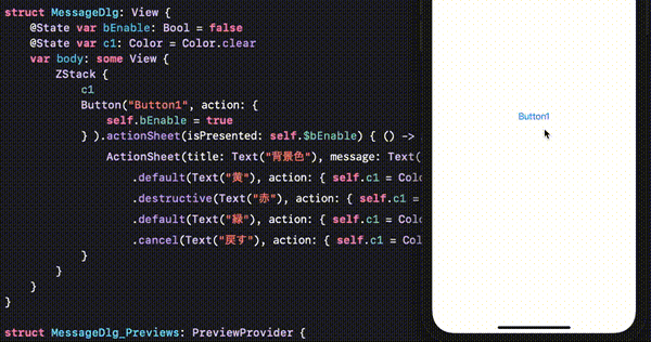
下のコードは、ActionSheetに複数のボタンを設定し、actionも追加した例です。

struct MessageDlg: View {
    @State var bEnable: Bool = false
    @State var c1: Color = Color.clear
    var body: some View {
        ZStack {
            c1
            Button("Button1", action: {
                self.bEnable = true
            } ).actionSheet(isPresented: self.$bEnable) { () -> ActionSheet in
                ActionSheet(title: Text("背景色"), message: Text("何色にしますか?"), buttons: [
                    .default(Text("黄"), action: { self.c1 = Color.yellow } ),
                    .destructive(Text("赤"), action: { self.c1 = Color.red } ),
                    .default(Text("緑"), action: { self.c1 = Color.green } ),
                    .cancel(Text("戻す"), action: { self.c1 = Color.clear } )])
            }
        }
    }
}

上のコードはZStackを使って背景色ColoractionSheetのボタンアクションで変更する例です。下絵のような動きです。

ActionSheetで背景色変更
ActionSheetで背景色を変更

SwiftUI アラート表示

SwiftUIのViewには.alert(isPresented: Binding<Bool>, content: () -> Alert)があります。contentにAlertを埋め込むことで下のようなアラートが表示されます。

struct Alert は、View継承ではないので .alert()の中に配置します。.alertのcontent内にそのままではprint()は入らないようです。シンプルなコーディングは下記です。

import SwiftUI

struct ShowMessage: View {
    @State var bPresented: Bool = false
    var body: some View {
        Button("Button1", action: {
            self.bPresented = true
        }).alert(isPresented: self.$bPresented, content: {
            Alert(title: Text("⚠️アラート"))
        })
    }
}

Alertにはtitle以外にも、アラートの本文を書くためのmessageや、ボタンの名称などが変更できるdismissButton・アラートボタンが押されたあとに動くactionなどの引数が設定できます。

Alert(title: Text("㊙️神のお告げ"), message: Text("あなたの過去を削除しました。"), dismissButton: .default(Text("☠️承知"), action: {
	print("過去を削除")
}))

選択できるアラート表示を作成する場合primaryButton, secondaryButtonが設定できます。

Alert(title: Text("㊙️神のお告げ"), message: Text("あなたの過去を削除しますか?"),
	primaryButton: .cancel(Text("削除しない"), action: { print("action primaryButton: .cancel") }),
	secondaryButton: .default(Text("🦠ぜひ削除"), action: { print("action secondaryButton: .default") })
)

それぞれのボタンに設定している.default() .cancel()に文字列とボタンが押された場合のactionが設定できます。ボタンに.destructive()を設定した場合ボタンの文字が赤で表示されます。

import SwiftUI

struct ShowMessage: View {
    @State var bPresented1: Bool = false
    @State var bPresented2: Bool = false
    var body: some View {
        VStack {
            Button("Button1", action: {
                self.bPresented1 = true
            }).alert(isPresented: self.$bPresented1, content: {
                Alert(title: Text("㊙️神のお告げ"), message: Text("あなたの過去を削除しますか?"),
                primaryButton: .cancel(Text("削除しない"), action: { print("action primaryButton: .cancel") }),
                secondaryButton: .destructive(Text("🦠ぜひ削除"), action: {
                    DispatchQueue.main.asyncAfter(deadline: .now() ) {
                        self.bPresented2 = true
                    }
                }))
                
            })
            Color.white.opacity(0).frame(height: 0.1).alert(isPresented: self.$bPresented2, content: {
                Alert(title: Text("⚠️エラー"), message: Text("あなたの過去は削除できません。"), dismissButton: .default(Text("OK")) )
                
            })
        }
    }
}

キャンセル付きのアラートを出したあとにアラートを表示する場合上記のように書けばうまく動作した。@State の変更は一旦メインに返さないといけないみたいだった。

2022 MJELD TECHNOLOGIES. ALL RIGHTS RESERVED